Designs for an Artificial Intelligence
assistance in Spotify application
Role: UX Designer, UX Researcher
Team: Nima Shahab Shahmir, Yura Kim, Sophia Shin
Timeline: January - March 2023
Tags: UX/UI, Mobile App, IOS App, Usability Study, User Research
Tools: Figma, Google Docs, Google Slides, Google Meets, Zoom, Slack, Apple Voice Memo
Detail: UX Design Project
At-a-Glance

In this UX design project, my team and I designed a Spotify interface with an AI (Artificial Intelligence) music assistant. This feature allows users easily create playlists based on their listening history and supports both text and voice commands. We focused on a user-friendly design that integrates AI smoothly into the Spotify app.
My primary focus revolved around collecting user feedback, research, and designing the interface for the initial phase of user text search and main menu of Spotify AI Music Assistant.
Problem
Spotify users often struggle with the app's cluttered music and podcast menus, making it hard to find music that fits their mood. They want a quick, accurate AI assistant that can suggest relevant music based on their preferences, with both voice and text search options for convenience.
Solution
Our goal was to create AI-powered interfaces for Spotify that generate personalized playlists based on user preferences and situations, improving the browsing experience. This could increase user confidence and engagement, potentially boosting premium subscriptions.

Process
My team worked closely together to make sure our design looked and felt like it was part of the existing Spotify app, using similar styles and colors. We learned from other successful music services and began with simple sketches. We then conducted detailed studies and interviewed 12 participants to understand what they needed.
Using their feedback, we improved our design three times, creating a more polished version each time. The final version is a user-friendly feature in Spotify that helps users enjoy their music experience more smoothly and effectively.
User Research
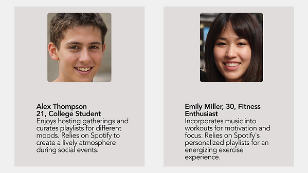
I led interviews with four Spotify users, from seasoned users to newcomers, to understand their needs for the new AI music assistant. Their feedback guided our team in designing a simpler, more personalized Spotify interface. Users wanted easier playlist management, intuitive searches, and artist-based playlist views.
Personas


Sketches & Wireframes
Sketches
Each team member created initial sketches of the interface design. My specific task was to outline all the menus to comprehensively understand the sections I would be developing. Below is my initial sketch for this project.

Medium & High Fidelity Wireframes
During the project, I designed the main menu and search features for the AI music assistant, collaborating closely with my team. I started with mid to high-fidelity designs, which are detailed drafts showing how the final product will look. After refining these based on user feedback, I finalized the high-fidelity design for the AI music assistant feature.


Usability Study
I conducted user testing sessions with seven participants, both in person and via Zoom, where I introduced the project and had them interact with a prototype to complete various tasks. This helped assess the user-friendliness of my designs.The feedback from these sessions was invaluable, allowing me to make iterative improvements to enhance the overall user experience.
The data gathered from participants' responses was crucial in refining the design process for this project.
Design Iterations
I refined Spotify's AI music assistant based on user feedback from a usability study, focusing on simplifying interactions.
-
Main Menu Enhancement:
Initially, the menu was cluttered, overwhelming users. I redesigned it to be more compact, positioned above the search box, allowing seamless access and eliminating the "Start Session" button. -
Recent Prompts Section Redesign:
Feedback revealed the vertical scroll and delete option for past prompts was cumbersome. I simplified this by introducing a long tap feature to delete prompts, enhancing usability and saving screen space.

Final Design

What I Learned
-
Iterative Enhancement: Constant refinement based on user feedback resulted in a more intuitive designs.
-
User-Focused Design: Development was steered by user insights, ensuring the design met their needs.
-
Streamlined Menu and Navigation: An improved menu layout facilitated easier navigation and interaction.
-
User Input Integration: Valuable user suggestions played a pivotal role in shaping the final design.
-
Efficiency and Effectiveness: Striking the right balance between simplicity and essential features created an efficient music experience.
My experience highlighted the significance of iterative improvement, putting users at the center of design, optimizing navigation, embracing user feedback, and delivering a streamlined yet powerful music interaction tool.